LTHForum
This particular forum in an odd way has both forms of review. While the majority of content within the site is in fact done by the user, people often repost reviews from other sites as well to justify their own opinion or point. Most often the review taken is from a 'professional', or they bombard the site with a few reviews from Yelp, and hyperlink to the rest for the readers viewing.
My only qualm with this is people generally disregard reviews from Yelp. It seems apparent that people are paid to write some of these reviews, and may even be the restaurant itself in disguise attempting to give themselves a better name. This makes it difficult to give justification to any postings you see within the Yelp realm.
As far as review aggregation goes, I think of sites such as Digg. Digg users post links/posts that they deem worthy of the day. More often times than not these postings are tech, news, or random 'nerdy' factoids. I enjoy Digg because of the variety it offers. Postings are extremely different, which can spice things up a bit.
In regards to LTHForum, it's a mixture of reviews. I wouldn't say it is a review aggregation site, but it could be if you noted the use of other reviews posted. In my opinion, I'm glad it isn't and it is based on the user review. This gives the user the ability to post on the restaurant of their choosing, and write up a review however they see fit. Also, with review aggregation I'm sure you wouldn't be able to find the smaller 'mom n pop' restaurants that are sprinkled throughout the city and suburbs. I typically find these places to offer some of the best food, and they're typically unknown and base their clientelle off word-of-mouth.
All in all, it's up to the reader to decide whether or not they enjoy a review aggregation or a user review. In certain cases I'm sure the aggregation has its upsides- a review done by someone who is deemed a professional in their field? As of now, I'll stick with what is offered at LTHForum, and not take it for granted, until someone bashes a favorite restaurant or I'm provided with one word reviews.
Saturday, July 17, 2010
Thursday, July 15, 2010
LTHForum: A food lovers heaven and hell.
New Media friends, we all love food. LTHforum is here to satisfy your love of food and disprove rumors within Chicago and beyond. Not everyone has the same palate, so it's nice to have a multitude of opinions on restaurants and you can be the final verdict to whether you agree or disagree.
The forum lets its readers perform various tasks while letting everyone voice their opinion- from the amateur individual, such as myself, to the professional diner review.
Forum
As the site notes, LTHforum is exactly as it sounds. A giant forum of restaurants within Chicago, as well as multiple areas outside of the city, or even state. While there is an abundance of information available, it can often be difficult to find a review on a restaurant you actually hope to go to. The site does offer a search option, but the results are few and far in between what you may be looking for. If the options to search were set in a different fashion than:

Individual Reviews
The forum here is a nice change of pace and offers opinions from various sources. This may be an individual who simply enjoys a specific restaurant and wants to let the rest of the community in on their secret, or a professional within their industry giving their own wisdom and insight. Regardless of their title, the reviews are honest, and beneficial. The writing style within each entry is easily navigated and often contains pictures to assist their description.
One of the more enjoyable and detailed posts was on the Green Zebra.
The Review:


The forum lets its readers perform various tasks while letting everyone voice their opinion- from the amateur individual, such as myself, to the professional diner review.
Forum
As the site notes, LTHforum is exactly as it sounds. A giant forum of restaurants within Chicago, as well as multiple areas outside of the city, or even state. While there is an abundance of information available, it can often be difficult to find a review on a restaurant you actually hope to go to. The site does offer a search option, but the results are few and far in between what you may be looking for. If the options to search were set in a different fashion than:

they may have a greater success rate or viewer ratings. I understood that in order to find Hot Doug's I needed to search Topic Titles Only, but someone who is more novice to the internet and the forums might have a more difficult time. Such as, my mom. Someone who is rather computer illiterate. She was up in arms when I told her about the site, but she couldn't navigate it to save her life. Unfortunate, but true.
Individual Reviews
The forum here is a nice change of pace and offers opinions from various sources. This may be an individual who simply enjoys a specific restaurant and wants to let the rest of the community in on their secret, or a professional within their industry giving their own wisdom and insight. Regardless of their title, the reviews are honest, and beneficial. The writing style within each entry is easily navigated and often contains pictures to assist their description.
One of the more enjoyable and detailed posts was on the Green Zebra.
The Review:

Which is further assisted by a multitude of pictures taken by the user at the restaurant:

Further pictures and reviews of the Green Zebra can be found Here.
I find that the pictures are an essential part to the reviews failure or success. If they describe something as being light and fluffy, and then the picture completely negates that opinion- they haven't done their job. I had hoped to use this tactic within my own personal blog, but in some cases I hadn't been to the restaurant the week of the posting. It may have been a prior experience, so I had to do some datamining and use pictures from a different source- same restaurant, but the picture was taken by a different individual. And often times, I simply didn't have the money to buy several entrées to show off to the blog . I should have taken this in to consideration prior to posting. Money is always helpful.
Conversation Aspects
Another meaningful or beneficial aspect to these forums is that everyone has the ability to voice their opinion and essentially create an ongoing conversation between users. For instance, the next review agreed with the post prior and added their own opinion of their Green Zebra dining experience. This gave the user, myself, the option of several more dishes to try when I head to the Green Zebra.
While this review lacked pictures, their description shows that they had some culinary experience or a mature palate as they described the dishes and its highs and lows.

Links
One area of LTH that can be extremely helpful is the Reference Forum. This contains links to various restaurants in and outside of Chicago, as well as translated menus. This actually came in handy as I had a second cousin from Sweden visit us recently, and he asked if I knew of such a place. His English is spotty, so the menu was extremely helpful to his adventure he took downtown with his girlfriend.
It's areas such as this that can make or break a site. In this instance, this was definitely a high-point for the site and its forums.

Heaven or Hell?
I suppose I should enlighten everyone on the chosen title. The user-generated content could make life heaven or hell for the reader. You may enjoy a particular restaurant and then read a review bashing its service and quality of food, making you less tempted to enjoy a second go-round at your own restaurant of choice. Or, you could attempt to dissuade the person from their high horse and share your own experience encouraging them to give it another go. Either way, this site could really either be helpful, or piss you off to the point of no return.
My Judgement
My overall opinion was that the reviews were honest and often greatly detailed to why the user did or didn't like the restaurant they reviewed. In most cases the reviews were extremely helpful, especially when deciding on whether or not I wanted to try out an Indian restaurant near my home town. I managed to find it within the forums and had reviews rating from both sides of the spectrum and decided it'd be worth my while to try it out and see which standards it lived up to.
So, the reviews do help, but it's up to you to make the final verdict. Check out the site and try out something unique and be the judge.
Sunday, July 11, 2010
Power of Social Networking
While my posting for Urban Chat was rather mundane, and I generally disliked the site... I do believe that within social networking someone or anyone has the potential or power to generate millions of followers for little or no apparent reason. Most recently, my new personal favorite is a guy (Justin Halpern) on twitter. He simply wrote down the shit his dad says, and has found himself with prospects hunting him down to create a book (twitter account @shitmydadsays). I find it to be hilarious.
More importantly, the reason I came back for another posting. The power of social networking. I was displeased with Urban Chat, yada yada yada, but I found this article on the Twitchhiker. Twitter alone was able to generate enough interest and innovation to have Paul Smith travel the world...For free. The article is an awesome read. If you doubt the power of Twitter, as I did, check it out.
http://www.dailymail.co.uk/news/article-1293636/The-Twitchhiker-The-amazing-story-Paul-Smith-travelled-world-free-using-Twitter.html
UrbanChat Review Part II
Urban Chat, www.urbanchat.com
The Writing
User vs Official Content
UrbanChat doesn't neccesarilly have a variation in or with user generated vs. 'official writing'. There is little actual 'official' content. The majority of content found within the site, is in fact user generated and it has little to no concentration or linear path. The users are able to post about whatever they'd like. The only variation found within the posts is where it may be found (which section of the forum).
Type
As said before, there is no actual rhyme or reason to what the post may be on. The only real way to tell is by the designated forum, but even then you can find random or unassociated content within the forum
Well Considered/Honed
By no means do I intend to degrade or dishonor the individuals who post on UrbanChat, but it seems that the general population of the site have little regard to what it is they post and their actual delivery. Many of the posts contain various gramatical errors, and/or have a great deal of internet 'lingo' that makes it extemely difficult, even illedgible, to read. I suppose if you had a decent knowledge of what all the abbreviations and the like actually meant, it wouldn't be such a struggle. Myself, on the other hand, have little knowledge of what these mean so it made reading posts a constant struggle.
Characterize Members
Honestly, I'm not sure how to classify or characterize the members within the Urban Chat atmosphere. While it seems that their goal is to reach people from an inner-city type area (a generalization by some of the slang and feel of the site) this isn't the only crowd they have gathered. The site varies in regards to age, race, and location.
Site Worthy?
In my opinion, no. The site has little owner or official content. The content is a public forum, so its give and take, or a grab bag for that matter on what you'll be viewing. Had the site had some more moderation and further aim, I'd give it a second shot. Also, if it wasn't an area to congregate and try and hook up with random people from your city/state/whatever it'd be slightly more tolerable. Overall, my one area of interest happened to be within the 'Battles' and 'Rhymes' forum section. The content within this section dealt with people posting the songs they created, or poetry. Most of which was excellent.
What you need to know.
The site is chaotic, and you'll never know exactly what you're about to stumble upon. The site also seems to have little moderation, so the content itself may often be NSFW (not safe for work) or even shocking to your own eyes. If you do decide to navigate on over to Urban Chat, I would suggest staying around the Battles and Rhymes area. The content is generally safe, and has some artistic value behind it. So, it's definitely readable and worthy content.
Friday, July 9, 2010
Urban Chat, Part I
I'm not even sure where to begin with the site UrbanChat.com...


Stated Purpose, Goal, Mission
The site is driving me crazy. There is nothing of this sort on the site. All you can gather from your first glance at the page is that it's "where the streets are talking". Men are Fellas, Ladies are Dimes. Everyone is half naked in their profile picture. Without the mission statement or anything of that sort it's hard to guess what the site is even used for. From the posts I saw on the homepage it looked like a place where 'urban youth' were trying to score 'booty'. Or, at least every other post had something to do with this. I wasn't even sure what I was signing up for in order to dive deeper in to the site. Point being, I signed up, and still have little idea to what actually happens on the site.
The only area of the site that is easily navigated and understood is the forum. Some categories were worthwhile, while others made me shrug and ask myself why? The games board was helpful in passing time, as it suggested. The rap battlez or rhyme-board was more than time consuming. Filled with 'urban poetry' or what I'd like to call song lyrics. Many of the songs written were incredible. The site gives this 'urban lifestyle' so much credit with all these categories, then you find yourself wandering to the park bench? Why? Is this really needed? This caught me off guard and I personally thought they could have avoided the use of this category.

Site Offers Members
Aside from the extremely vague homepage and lack of direction, the site does offer the ability for members to share photos, small blog posts, a personal profile, inter-site communication/messages, and a community that only you (a signed-up user) can access.

Official Writing
From navigating the site, I found little official writing (done by those who aren't members). There is a section on 'urban experts', but this is written by the members as well. It focuses on a topic of their own choice and they can voice their opinion. Much like what I'm doing right now. The only problem with these "Urban Experts" is that the writing is filled with errors and many contain the crazy internet lingo/spelling that made things extremely difficult to read. So as asked from us- The official writing is basically non-existent, it lacks a unified voice, the writing is informal and lightly edited, if at all.
I plan on venturing the site for awhile longer and coming back for a second posting covering a few more questions. Until then, feel free to navigate over to Urban Chat and check out what they have, or don't have to offer you, the user.
Thursday, July 1, 2010
Template Change
Almost forgot.... Template change again.
I abandoned the odd stucco looking background from earlier this week.

I'm not sure how well this works either? But, I feel like it's a step in the right direction from previous templates. I like the organic feel. It's like I was writing my posts on pieces of scrap cardboard. Not sure how great that is, maybe people will think I'm a bum? I like the color palate used and the ducks- gives you a 'country' type feel. The only displeasing aspect of the new template is the summary at the beginning of my blog. I'm not a huge fan of the brown on brown, or whatever color you'd like to call that.
I've got a bachelor party this weekend, and a wedding to attend next weekend so hopefully I can find some free time in between during the week to learn how to create my own template. Until then, we're stuck.
Blogging Tips, Round Two
I thought my previous post was on point, but could be improved with a bit of personal research in regards to what other bloggers had to say about improving your blog in general, or its rating.
Rather than flow, Stated Purpose.
My current description of my blog: I'm trapped back in suburbia after a several year hiatus in the city... My funds ran out so now I'm back. What the hell is there to do in regards to bars, entertainment, restaurants, golfing, fishing, etc in the West Suburbs of Chicago? New places, old places, me bitching about it all and maybe even enjoying it.
I often bitch and moan about how bad it is out here.... But, on the bright side it's cheap. Hopefully my dull weeks will have some highlights and maybe point you in the right direction if you're ever out west of Chicago.
I figure if I refine this and state that I am in the West Suburbs, travel around this area (not just limited to Geneva) and have some dining experience and a decent palate my opinion may be taken more seriously. I'm still undecided on whether or not mentioning age will give credibility, or discredit my blog.
Improving Theme
I find some comfort in the templates provided by blogger.com, but they don't suit my needs as well as I'd like them too. In any case, I feel the need to learn how to further edit/revise the template or even better yet, create my own from scratch to fulfill my desires.
My current template doesn't work in regards to my topic, or at least in my mind it doesn't.

Social Networking Activity
Blogging is all about numbers, and I don't seem to have any. If I were to link my blogging efforts to a twitter account or show updates through my facebook account I could drastically improve my number of readers. The only problem I see with this is many people I know are from Geneva, and may not care to read my reviews, or just have little interest in general since they have more than likely been to these places.
Links
I still believe links deserves a spot on the refined list. Without links to what it is you are talking about, or attempting to explain people may become nauseated by my rambling or efforts to describe the texture, taste, colors, etc of something I ate. Why struggle to explain in such great detail? My structure becomes affected, the page is less scannable, and it is much easier to get a 'feel' for something when the reader can actually see the item.
Visual Aid
This goes rather hand-in-hand with links. It is more convenient to the reader when they have the image laid out in front of them versus having to click links, or navigate to the page on their own.
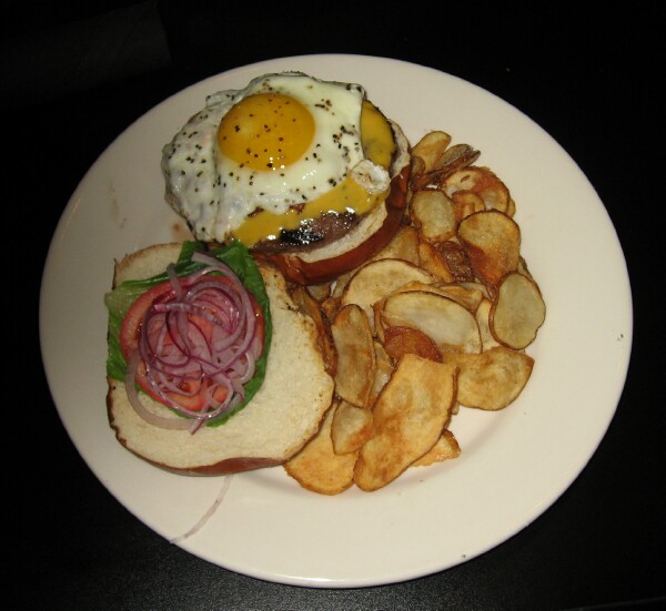
In my post on Surviving Suburbia, I didn't post a picture of the delicious pretzel burger I raved about. How can I explain a burger well enough to the point where you'd want to taste it? Also, the website, nor myself, had a picture of the burger. I felt it inappropriate to post a random picture of a burger, but a burger is a burger is it not? They all generally look the same.
This picture is from Kumas Corner... The burger at Ale House is the same in and out.

I realize I talk about these things, but haven't included any examples in my post. I'm not sure how I can justify using the examples or use them well. As I explain, I find it hard to find an appropriate example of what it is I am talking about.
Rather than flow, Stated Purpose.
My current description of my blog: I'm trapped back in suburbia after a several year hiatus in the city... My funds ran out so now I'm back. What the hell is there to do in regards to bars, entertainment, restaurants, golfing, fishing, etc in the West Suburbs of Chicago? New places, old places, me bitching about it all and maybe even enjoying it.
I often bitch and moan about how bad it is out here.... But, on the bright side it's cheap. Hopefully my dull weeks will have some highlights and maybe point you in the right direction if you're ever out west of Chicago.
I figure if I refine this and state that I am in the West Suburbs, travel around this area (not just limited to Geneva) and have some dining experience and a decent palate my opinion may be taken more seriously. I'm still undecided on whether or not mentioning age will give credibility, or discredit my blog.
Improving Theme
I find some comfort in the templates provided by blogger.com, but they don't suit my needs as well as I'd like them too. In any case, I feel the need to learn how to further edit/revise the template or even better yet, create my own from scratch to fulfill my desires.
My current template doesn't work in regards to my topic, or at least in my mind it doesn't.

Social Networking Activity
Blogging is all about numbers, and I don't seem to have any. If I were to link my blogging efforts to a twitter account or show updates through my facebook account I could drastically improve my number of readers. The only problem I see with this is many people I know are from Geneva, and may not care to read my reviews, or just have little interest in general since they have more than likely been to these places.
Links
I still believe links deserves a spot on the refined list. Without links to what it is you are talking about, or attempting to explain people may become nauseated by my rambling or efforts to describe the texture, taste, colors, etc of something I ate. Why struggle to explain in such great detail? My structure becomes affected, the page is less scannable, and it is much easier to get a 'feel' for something when the reader can actually see the item.
Visual Aid
This goes rather hand-in-hand with links. It is more convenient to the reader when they have the image laid out in front of them versus having to click links, or navigate to the page on their own.
In my post on Surviving Suburbia, I didn't post a picture of the delicious pretzel burger I raved about. How can I explain a burger well enough to the point where you'd want to taste it? Also, the website, nor myself, had a picture of the burger. I felt it inappropriate to post a random picture of a burger, but a burger is a burger is it not? They all generally look the same.
This picture is from Kumas Corner... The burger at Ale House is the same in and out.
I realize I talk about these things, but haven't included any examples in my post. I'm not sure how I can justify using the examples or use them well. As I explain, I find it hard to find an appropriate example of what it is I am talking about.
Tuesday, June 29, 2010
Top Five Blog Tips, Round One
This is the first of two postings. I wanted to experiment a bit with these ideas. I chose to use this first opportunity to give an unbiased, amateur opinion. I hadn't touched a blog on my own, nor intended to until taking this class. My top five blog tips are my personal opinion without outside influence.
I'm hoping with the second round of posting on this topic, and additional research I will realize the importance and issues of blogging that seem to be of the utmost importance. Until then, try and accept or level with my reasoning. Who knows, we may even agree on some points.
Flow
It's either flow or predictability. The more sporadic posts tend to be, the harder it is to read or enjoy. Our brains are powerful, we have the capacity to retain knowledge at a rate of 500 words per minute, but the best speakers can only produce a maximum of 150 words per minute which gives our brain the ability or tendency to wander often. I find this to hold true with blogs. Our eyes let us see such amazing things, but if it isn't coherent, I find it difficult to deal with. Although I sound like an idiot talking about cohesion or progression as I just gave a great rant.
For instance, I find my blog readable because it's logical and constant progression. The set-up is the same post after post.

Hopefully this doesn't make me sound like some pompous asshole and I'm in the right. Not the case. I'm just one person who likes predictability, this may not hold true to everyone.
Colors/Template
I suppose this goes with readability, or just overall feel. The only problem I have found thus far is I can't find a template on blogger that I feel comfortable with. I had hoped to achieve a 'feel' where the reader is aware I am writing about the Western Suburbs of Chicago and has the visual idea of country meets modern. I have yet to find this and in my attempts I've made some poor mistakes.
Mistake One- Enjoyed the sky/country feel, but didn't double check to realize I used a template that made parts of my text illegible.

Mistake Two- Picking a template that has ample room for text and images... I didn't resize my images and found that they found their way far outside the boundaries of the sanctioned box. Once again, I bitch about it and then do it myself. Classy guy. Jeff was kind enough to point this out without pointing, laughing, then hitting.

This also falls under another category- Visual Aid. The addition of images to further showcase the central theme or idea behind whatever it is I'm trying to say often helps. Hell, all the time. It's hard to describe the texture or creaminess of something I have eaten, the picture does far more justice. The only problem, stated above ^, is when I don't resize the image and it looks like a mess on the page. Credibility or thoroughness down the drain. It's like yelling at someone for spelling and you in turn spell something wrong in your rant. Never good.
Links
When whatever it is someone is talking about is easily accessible, not having to move your mouse too far or having to search, is always nice. Unfortunately I tend to be terrible at this, and have been working on improving. Linking is my damned kryptonite. I remember to involve it when it is a meaningless link, such as the Billionaire song when I had talked about being rich. But, when it is needed... It's typically not found.
Age
This is where I was struggling for a fifth blog tip and this actually seemed to make some sense, although it has little to do with the aesthetics or readability of a blog. I have been in constant debate of switching my 'bio' or the intro to what my blog is all about. And, within this debate was whether or not including my age could damage my credibility or level of opinion when it comes to my opinion on food, beers, liquor, and entertainment. At this point, I am still unaware. It may be taboo. There are some extremely old people on Facebook, such as my neighbor's grandma that I'm friends with. Weird. I know. Because of her age I often second guess what she says, or often times even ask myself what the hell is she even doing on Facebook. If I mention my age will I fall in to this taboo or blackhole?
As far as changing templates goes, I haven't found a solid template quite yet. I've been experimenting, but haven't found one that really jumps off the page or plays to my topic. I found that my first improvement could be within my Class blog.
Currently, it's mundane. White background, black text always stand out. But, there isn't much appeal to this. It's as if you were reading an essay that I printed out for you. Where's the fun in that?

The update has a color palate that I can deal with for the time being. I like the contrast of the dark black background with the lighter blue text. The text still pops off the background making the text outside the text box easily readable. I kept the black text on white background because it is easily read and once again, 'pops' off the darker background.

Saturday, June 26, 2010
Serious Eats.
My postings last week covered both content and design, so I opted to choose another food/restaurant blog to review to make this worth your while. The second blog is Serious Eats.
Purpose
Serious Eats looks to inform its readers of worthy restaurants across the US, as well as a vast selection of recipes, as well as hints and tips to your daily cooking needs.
Audience
There is no particular audience in mind this time around aside from the food conscious. The site covers a larger portion (the entire US), unlike LickMySpoon only covering eateries in San Francisco and New York City.
Message
With the larger area to cover, the site lacks concentration, or may make things more difficult on the reader when it comes to finding a specific area of the US that they may have particular interest in, or more commonly, live there.
Another aspect that I enjoy is that they match-up chain restaurants. While the restaurants aren't always my ideal place, it is always enjoyable to see what the true restauranteur has in mind when it comes to these more mundane places.
Organization
While they do cover an array of topics, everything stays organized nicely. The site is broken down in to the Home Page, Eating Out, Recipes, Columns, Quizzes, Techniques and their shop. The site balances being content rich and organized without overloading any particular area. It's clutter free.
Style
The colors for the site (background) are odd, but they work. The blog and typeface is kept clean by using the white background with black text and blue hyperlinks. The white 'pops' in front of the lime green background and helps maintain a clean, readable look.
LickMySpoon, Content.
Lick My Spoon is targeted towards a crowd of 'foodies' based in San Francisco, although some of the information they provide can be used elsewhere or inform those who plan on visiting the area.
While this may hold true, the site is still very 'content rich'. The information can be applied across an array of venues, specifically the recipes available to viewers. Each recipe is detailed in its ingredients, cooking instructions, and is emphasized or improved by the use of pictures throughout the recipe. They often show the dish from point a, to b. This way the reader can judge their recipe in comparison by the use of these pictures. If your rue doesn't seem thick enough, or the right color they simply look at the picture to see if they are in fact heading in the right direction.
While this may hold true, the site is still very 'content rich'. The information can be applied across an array of venues, specifically the recipes available to viewers. Each recipe is detailed in its ingredients, cooking instructions, and is emphasized or improved by the use of pictures throughout the recipe. They often show the dish from point a, to b. This way the reader can judge their recipe in comparison by the use of these pictures. If your rue doesn't seem thick enough, or the right color they simply look at the picture to see if they are in fact heading in the right direction.
Saturday, June 19, 2010
LickMySpoon Design
While as mentioned above, the site does have a plethora of worthy information, but only applies to those who live in SF. My blog tends to fall in the same category. If you don't live around the area, the blog has little appeal or pertinence to the reader. Obviously if I had the money and was able to, I'd expand my travels and write from all over, but until then West Chicagoland area is my designated location. My only debate arises from whether or not I should begin to mention other happenings within the area that aren't a food/entertainment location, such as the Swedish festival in Geneva starting Monday.
But, back to design.
The structure of the site is predictable, which I enjoy. The content itself doesn't share this quality (may switch from a chef/website review/food). Either way the the blog flows in an efficient manner, and is balanced well. The traffic or information isn't overwhelming on one side of the site and a barren wasteland on the other. The blog is readable and the archives are highlighted by the rich, colorful pictures used within the article.
My only complaint about the site was the color choice. While I do realize that that deep burgundy they used could resemble a rich cab of some sort, since well, it is wine country... The colors just don't work for me. I feel like I have to strain my eyes to read the lighter burgundy on top of the darker. Something about the color palate just rubs me the wrong way- I'm sure it's readable to others, but it's not working for me.
Aside from that the clarity is wonderful, if not far above par and the functionality of the website is fine. It's easily navigable and it isn't extremely cluttered which helps a great deal.
Overall I feel that the site serves its intended purpose and does it well.
Friday, June 18, 2010
Blog Review
Lickmyspoon.com
We were asked to find a blog similar to our own, and I found that LickMySpoon and own blogginig efforts were relatively close in style and aim. We both hope to inform our audience of places to eat and a review to why we believe it is a respectable location.
Purpose
LickMySpoon has then intention of informing their audience of local (SF CA) restaurants worth pursuing, what they offer, and why they should eat there. They also attempt to inform readers of general culinary news- up and coming chefs, restaurants, ideas, promotions.
Audience
I'm going to go on a limb here and say that it is aimed at people that enjoy food (foodies) that live within the San Francisco area.
Message
The message seems to be simply to inform and it is accentuated by wonderful high-res photos to prove or heighten their point.
Organization
The site is laid out in a simplistic manner. Blog entries are listed from most recent to least, the archive is easily accessible and uses pictures to highlight the topic of choice (typically a food item). My only complaint is within its color palate. The color reminds me of a deep red wine (cab), but this color with its counter part (lighter text) puts some strain on the eyes. Just in my opinion.
Style
Although I am put off by the color, it does make sense. California is wine country, and wine paired with particular foods is often essential to making the meal over the top, the color does work in this way. The graphic design used is wonderful, I like the combination of the paisley and the spoon (I have some odd obsession with paisleys, they're a crazy mathematical oddity, like a fractal). THe site is easily navigated and has shed some light on my own needing to take pictures when I visit these places. The pictures add such great detail without having to use too much text to back up my points, and gives the reader much more familiarity with what exactly they are trying to explain. I lack this, and need it. Note taken and hopefully applied.
Sunday, June 13, 2010
Intellectual Property Round 2
To start things off with a bang, I haven't kept myself up-to-date with my internet findings. I had heard of Creative Commons, but never found myself venturing to the site and researching on what it is they did. To say the least, I'm a fool for that one.
With that being said, everything was pretty damned new to me and hilarity ensued as I wandered the site. Wikipedia. Wikipedia is a user of CC licenses, and it brought me back to Keen. A man whom hates Wikipedia and the new amateur the internet has created. I personally think the guy is a smug ass hole. I dabble or foray with random hobbies, such as this blog (even though it's for class, I still consider it a leisurely activity). If I had the platform, knowledge or balls to knock him off his high-horse, I would. But, unfortunately I can't. Don't have to the wit, and more importantly he'd talk circles around me.
After further looking in to Creative Commons I became curious to if anyone I knew happened to use the site. Unsurprised, nearly all 'musicians' I know have used the site. I think the idea behind this site, or movement is incredible. One friend in particular said he's posted several songs he has written and gotten a great deal of response, including adjustments to certain sections. He says he's also done the same with other peoples' work. It turns everything in to this giant musical playground where there are no longer any limitations with what you can do, or have access to. The ability for artists who have never met, dabble in different genres, etc. to collaborate just blows me away.
I'm still looking in to the other venues, but musically I think it's a giant step. Most notable is probably Trent Reznor using CC to allow people to use his work. From what I remember there were several contests awhile back where fans had the chance to remix his work. I wasn't sure on the legalities behind this, but now I have a general understanding of this.
Sunday, June 6, 2010
Intellectual Property- MashUp
I'm not sure if anyone else out there has any familiarity with Girl Talk, Hood Internet, Daft Punk, etc. etc. The more notable 'mashup' artists.
I'm no wordsmith here, and I like Girl Talk, but I believe the NYTimes sums up the entire issue far better than I can ( http://www.nytimes.com/2008/08/07/arts/music/07girl.html ). But, if your greedy and giddy fingers don't feel like clicking that link and straining your eyes- the article talks about Gillis (Girl Talk) and how he falls in between the cracks of piracy and copyright law because of the 'Fair Use Act'. This law is in place where as a reviewer you can use small 'clips' in order to support your review. Gillis says his clips are extremely short and then turn in to a new song in its entirety... So he is 'above the law'.
Another source that can explain this entire issue (for all artists, not just Girl Talk) is Rip! A Music Manifesto... which can be found on Hulu the last time I checked. Head that way if you have any interest- here's a 'sample' from YouTube.
Hopefully the half-naked dancers don't distract you from what is actually being said.
Keen also talked about Citizen Journalists with our assigned readings. To be honest, I'm a fan of citizen journalists, even though they may be amateurs. I often find myself reading these citizen journalists over mainstream paper/media. ViceTV, gizmodo, engadget, etc. None of these individuals are experts in their field per say, but I still entrust their opinions. Pity the fool who does such things according to Keen, so apparently I'm one of those fools. I realize they aren't experts, but their knowledge can still be applied to this field and if I'm still indifferent to their opinion I'll find myself reading a consumer report or trusted site in regards to reviews.
It feels as though there is some black hole within the term citizen journalist.
And now speaking of all these reviews my mouth is going to attempt to review some food. Hungry man out. I'll finish this...
Thursday, June 3, 2010
Intellectual Property
The two Keen articles we were to read brought about some scary aspects of the internet that I had not put much thought in to... we're out to ruin everything.
Rather than the highly educated expertise (dictatorship of expertise) we now have a 'dictatorship of idiots' who have the inherited this new power of 'free speech' on a much higher and publicly viewable platform. I believe the most sound example of this is Wikipedia- which I have often looked to for various information (typically regarding music more than anything). Rather than using standard issue sources, which have paid, educated employees we now pool our resources from a forum that anyone can voice their opinion (edit) and we believe what we see- we don't read in to the details of the site being run by 'amateurs'.
Speaking of amateurs, has this term changed in the Web 2.0 world? I believe it has.
Merriam Webster Dictionary:
Main Entry: am·a·teur
Pronunciation: \ˈa-mə-(ˌ)tər, -ˌtu̇r, -ˌtyu̇r, -ˌchu̇r, -chər\
Function: noun
Etymology: French, from Latin amator lover, from amare to love
Date: 1784
1 : devotee, admirer
2 : one who engages in a pursuit, study, science, or
3 : one lacking in experience and competence in an art or science

Amateur in Web 2.0 does not exist....
If you can post online and speak your thoughts and you garner a decent amount of traffic, you're a professional. They may spat countless amounts of bullshit to their viewers, but if they believe in the opinion, then we've lost. I believe Perez Hilton is a prime example of this. He took his 'hobby' and some how turned it in to a 'professional' atmosphere where people often find themselves reading his bullshit rants and celebrity gossip. If this blonde frosted tipped idiot can manage to turn his hobby in to a paying and famous gig, anybody can.
I'm an amateur. I have never blogged before this class, and the points Keen brings to fruition terrify me. If you aren't scared, go to Perez Hilton's blog and attempt to put the pieces together on how he has reached celebrity status, and collecting paychecks while we are pay with this class to blog, rather than paid ourselves.
Subscribe to:
Comments (Atom)